Fashion
Design as an answer to chaos | Ahmad Amer
Ahmad Amer is a Lebanese Fashion Designer and Illustrator who graduated from Creative Space Beirut last year and whose eye for everything design caught our attention. Ahmad told JDEED about his journey at CSB, his inspirations and future plans.
Tell us a bit about your journey at Creative Space Beirut, what you retain from your learning experience there and how does it feel to be graduated?
My journey at CSB was an experience of a lifetime. During those three years I learned a myriad of things that helped become the person I am today. I worked on myself as a person, nurtured my skills as a designer, and developed my brand. Consequently, I consider these three years to be a turning point in my life and I consider Creative Space Beirut to be a vessel that fills you up with so much creative energy that it actually fuels your dreams in ways that I still am trying to figure out. The most unique thing about this vessel is that everyone contributes to it and the results are life changing to each person, every time. I feel like I have matured in many aspects and I feel like I am ready to take on my responsibilities as an anticipated designer.
What were your inspirations for this collection?
Usually, my inspirations are drawn from the reality that we are living, from people’s daily problems and from issues that seem to be never ending. Regarding this year’s collection, the theme revolved around the corrupted structure of the country, a structure so infused with violence, destruction, and violated principles. I pondered what might be the solution for this rooted disaster and its branches and I decided to deal with it satirically; I imagined a world where superpowers exist, where everyone has a code and they are all connected to one ‘mother-chip’. This chip represents the surveillance that monitors people’s actions rewards or punishes them accordingly.. In my vision, the world consisted of four main colors that imply different energies; red symbolizes happiness, enthusiasm, and joy. Black symbolizes the need for change. Olive symbolizes wisdom and stability. White resembles purity and transparency. My last look incorporated the color off-white ; this represents the shattering of a hope in a pure, transparent world and represents the helplessness in dreaming of it when no solid action is being made. The solution lies in initiative and action, and not in dreaming.
What is the story behind the hand-embroideries we see in you collection?
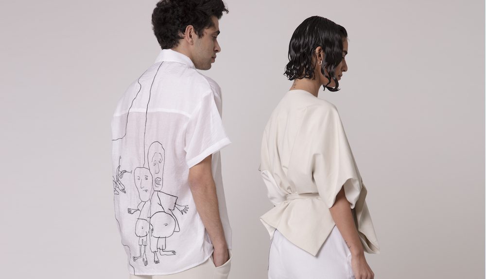
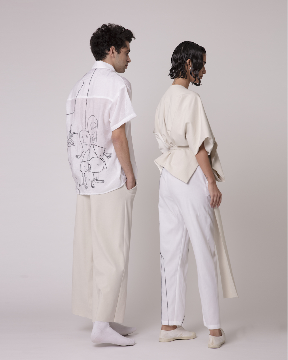
The embroidery in my collection are projections from the chaos we live in. It conveys images of unattractive beings, malicious smiles, and invasive limbs. They resemble the factors of corruption that we have grown to know so well. I used them to show how these images of corruption were in everything especially the white outfits on which they leave a clear, memorable impact.
Who is your target market?
My main concern for this collection is that it reaches a wide audience with the message it is conveying. I am interested in raising awareness regarding the corruption that intestates our lives and I am interested in making sure people stay reminded about it. That is why I am not as interested in reaching a niche target market with my prices as I am interested in making sure I am heard. I am targeting various age ranges, various tastes, and various backgrounds. I look at this collection as a whole. It definitely is targeted towards a costumer who understands and advocates this message as well and who is confident enough to defend it.
Which fabrics and colors do you prefer to use? Why?
Fabric wise, I like using a fabric that has its own volume. Neoprene is definitely a favorite. I avoid textured fabrics because I prefer the neat, minimal, ultra modern finish. This serves in helping me use them as canvas for my illustrations. On the flip side of the coin, I also like fabrics that are overly detailed. I lean towards the extremes when it comes to fabric choice. As for colors, I also lean towards neutrals; black, white. But I also like using primary colors like red, yellow, blue.. Colors that pop. I like earthy colors because they work well with the body’s natural tones. I work well with all colors depending on the inspiration. Basically though, black is my go-to color because it emphasizes the structure of the design.
Where do you see yourself in 5 years?
In 5 years, according to what I have in mind, I see myself more mature with a wider knowledge as a designer. I visualize building an established brand that sheds light on the subjects I believe in. I don’t imagine myself being a designer who sells for the sake of selling, on the contrary. I imagine being a social and fashion figure who is flourishing in educational and various projects.
Can you give us a glimpse of what your next collection will be about?
Regarding the new collection, I will not disclose much details. But I know that illustrations are part of my identity. Hence I feel like my brand will be based on illustration. The new collection might have illustrations that arise from reality yet still champion a mythical feel. I’ll leave the rest to your imagination.


0 comments